Color is one of the most powerful elements of branding. It influences perception, evokes emotions, and plays a big role in how customers connect with your business. When it comes to promotional products, choosing the right colors can make the difference between an item that gets tossed aside and one that becomes part of a customer’s daily life.
Having worked with brands across industries, I’ve seen how thoughtful color choices transform simple merchandise into impactful marketing tools. Let’s explore how to select the best colors for your promotional products and why this decision is so important.
Why Color Matters in Promotional Marketing
We often underestimate just how much color shapes consumer behavior. A red T-shirt feels energetic and bold, while a soft blue notebook feels calming and trustworthy. By using the right shades in your merchandise, you extend your brand identity into physical form.
This is especially critical when designing custom promotional products because these items serve as long-term brand ambassadors. Unlike digital ads, they remain in front of customers for months or even years, making color consistency essential.
Working with a Wholesale Supplier on Color Options
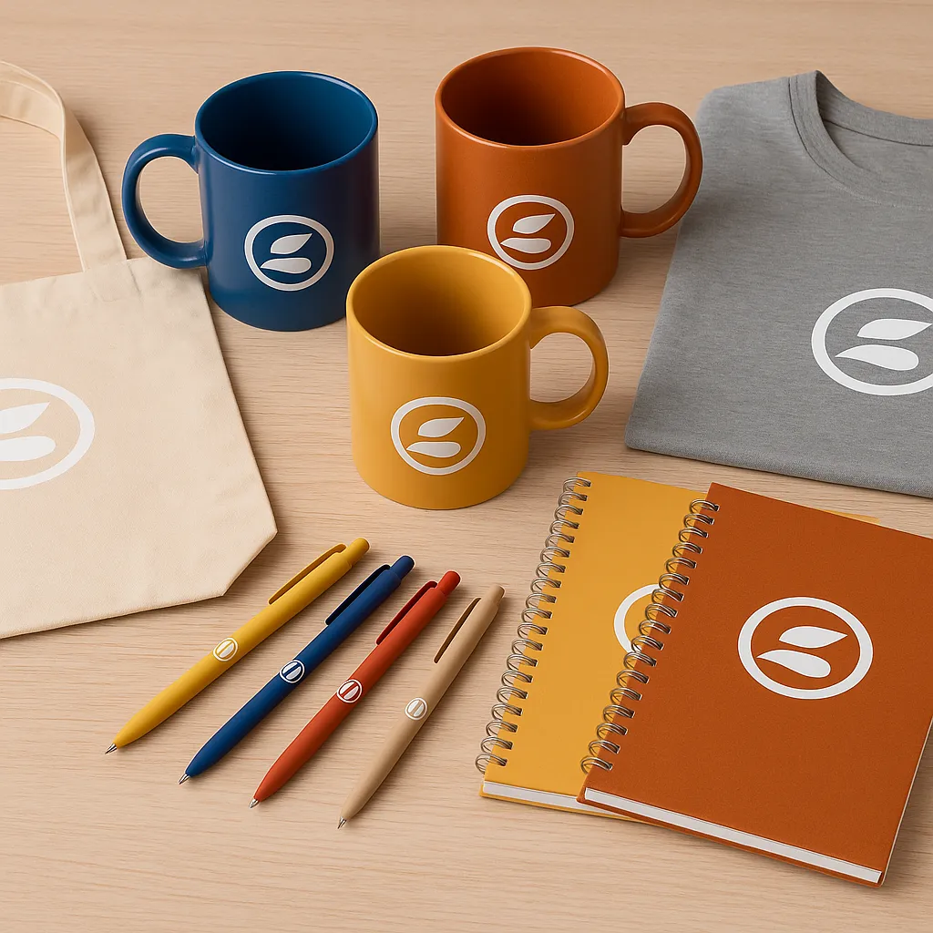
When sourcing from a promotional products wholesale supplier, you’ll often find a wide palette of available shades, but not every color may be an exact match for your brand. That’s why it’s important to collaborate with suppliers who can offer custom color matching (often using Pantone codes) or at least provide a close approximation.
Suppliers also tend to group certain products by material or finish, which can affect how colors appear. For example, a logo printed on a matte tote bag may look slightly different than the same logo on a glossy mug. Asking for samples in advance ensures consistency across all items.
The Psychology of Color in Promotional Products
Colors carry emotional weight, and understanding color psychology helps you select shades that align with your brand message. Here’s how businesses commonly use colors in promotional campaigns:
Blue is associated with trust, reliability, and calm. It works well for tech, finance, and corporate merchandise.
Red creates energy, urgency, and excitement. It’s ideal for industries like food, sports, or retail promotions.
Green communicates health, growth, and sustainability. Eco-friendly brands and wellness companies often favor it.
Black and White bring simplicity, professionalism, and timeless elegance. They are safe choices for luxury or formal industries.
Yellow and Orange suggest friendliness, creativity, and energy, making them perfect for startups, entertainment, or youth-focused campaigns.
By strategically using these associations, your promotional products not only look good but also reinforce the values your brand wants to project.
Matching Colors to Product Types
Not every product is suited to every color. Certain items naturally pair better with specific palettes. For example:
Apparel: Neutral tones like black, gray, and navy are versatile and widely worn, while bright accent colors can make limited-edition apparel pop.
Drinkware: Bold, vibrant colors stand out for water bottles or mugs, but sleek metallic finishes often appeal to professionals.
Stationery: Earthy tones like beige, green, and navy work well for notebooks and planners, making them practical and stylish.
Tote Bags: Natural cotton beige is timeless, but pairing it with colorful prints can make a statement.
The best strategy is to blend practicality with brand personality. A product people enjoy using in their daily lives is more valuable than one that’s too flashy to fit their lifestyle.
Seasonal and Contextual Color Choices
Timing also matters. Seasonal campaigns often benefit from colors that reflect the moment. For example, deep greens and reds work well in winter, while pastels shine in spring. Limited-edition colors tied to holidays or events can spark excitement and create a sense of exclusivity.
Context is equally important. At a corporate trade show, muted and professional tones might be more effective, while a youth-focused festival may call for vibrant, eye-catching hues.
Real-World Examples of Color in Action
I once worked with a fitness startup that distributed bright neon water bottles with their logo. At first glance, the choice seemed risky, but the bottles stood out in gyms and outdoor settings, turning customers into walking advertisements.
On the other hand, a financial consulting firm I collaborated with chose deep navy notebooks with subtle silver embossing. The look matched their brand’s promise of trust and professionalism, and clients used the notebooks daily, keeping the brand visible for months.
These examples show how aligning color choices with both brand identity and audience context drives success.
Balancing Boldness and Practicality
It can be tempting to choose colors that are loud and attention-grabbing, but it’s important to strike a balance. Products should be memorable, yet practical enough for everyday use. A neon green tote bag might make an impact at an event but could end up unused at home.
A good rule of thumb is to pair a bold accent color with a neutral base. For instance, pens with sleek black barrels and a brightly colored clip can achieve both professionalism and visibility.
Final Thoughts
So, which colors work best for custom promotional products? The answer depends on your brand, your audience, and the context in which the products will be used. Blue builds trust, red creates energy, green signals sustainability, and neutrals like black and gray ensure practicality. Ultimately, the best colors are those that reinforce your brand identity while providing recipients with items they’ll use and appreciate regularly.
Investing in thoughtful color choices transforms ordinary merchandise into powerful marketing tools. By combining psychology, practicality, and creativity, you ensure your promotional products are not only seen but remembered.